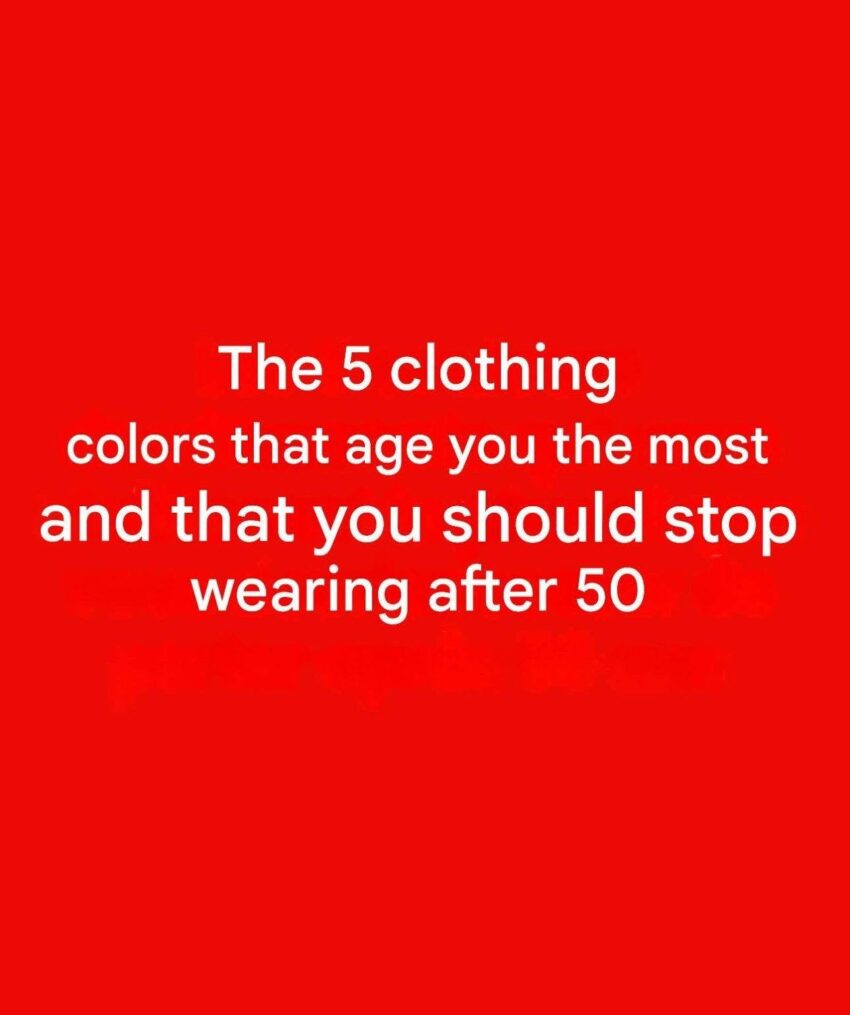
5 Colors That May Make Some People Look Less Vibrant After 50 (and How to Wear Them Better)
The idea that certain colors should be completely avoided after 50 is a style preference, not a rule. Skin tone, hair color, personal style, lighting, and the exact shade of a color matter much more than age.
That said, some shades can sometimes make the complexion appear more tired or washed out—especially when worn close to the face.
1. Very pale beige or grayish nude tones
Why they may be challenging:
- Some muted beige shades can blend with the skin and reduce contrast.
Try instead:
- Warm camel
- Cream
- Rich caramel
- Colors with a little more depth
2. Dull gray
Why it may feel aging for some people:
- Certain cool grays can make the complexion look less lively.
Try instead:
- Charcoal
- Silver gray
- Pair gray with brighter accessories or a flattering lipstick shade.
3. Yellow-green or overly muted olive
Why it can be tricky:
- Some yellow-based greens may emphasize uneven skin tone.
Try instead:
- Emerald
- Forest green
- Deep olive with warmer accessories
4. Washed-out pastels
Why they may not flatter everyone:
- Very pale pinks, blues, or lavenders can lack contrast.
Try instead:
- Jewel tones
- Clearer, brighter versions of your favorite colors
5. Dark colors worn without contrast
Why they can sometimes look harsh:
- Black and very dark shades may create strong contrast that some people find less flattering.
Try instead:
- Add color near the face with scarves, jewelry, or tops.
- Experiment with navy, chocolate brown, or deep jewel tones.
Colors that often add brightness
Many people find these shades flattering at any age:
- Emerald green
- Sapphire blue
- Burgundy
- Teal
- Coral
- Rich plum
- Cream
The most flattering colors are the ones that complement your individual undertone and features, not a specific age number. A simple test: hold a color near your face in natural light—if your skin looks brighter and your eyes stand out, it’s likely a good match.
